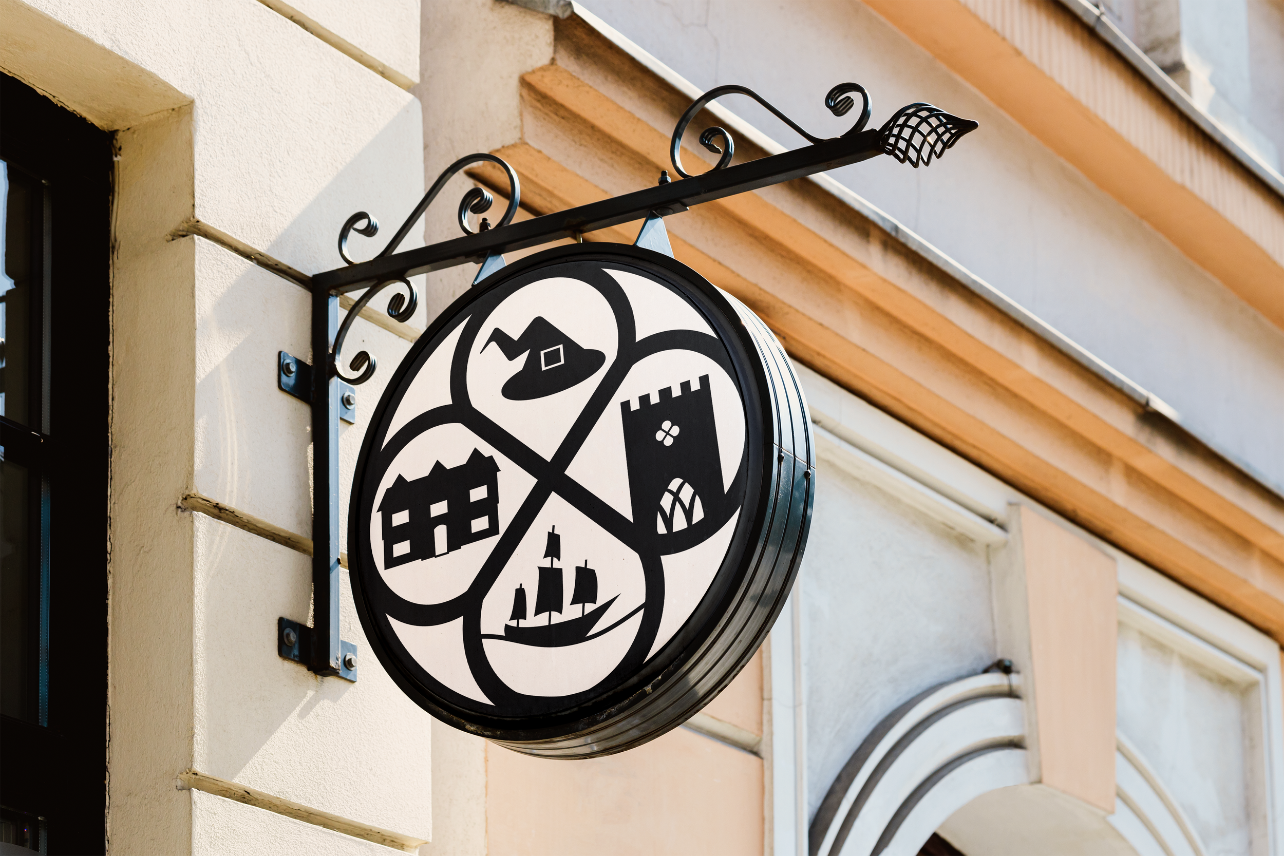
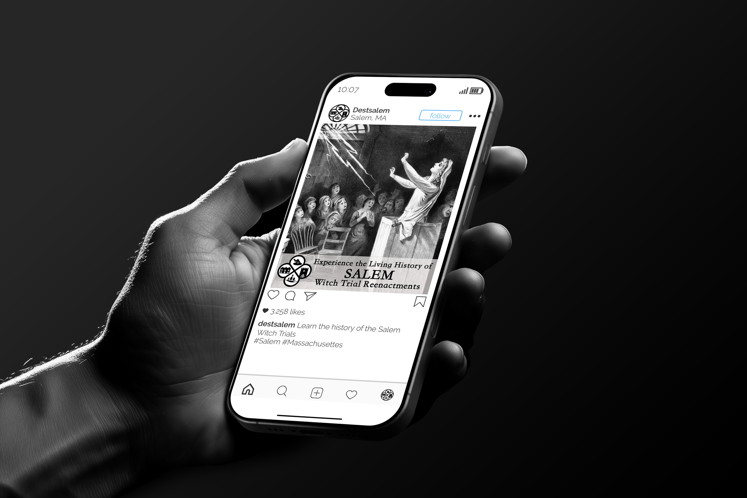
Salem City Rebrand
This project involved a rebranding effort for the city of Salem. The logo is composed of four sections: a witch hat, the Salem Witch House, a boat, and the First Church of the city. Each element represents a different part of the city. The boat symbolizes the seaport, the church represents both its history and religion, and the shape of the logo is the same as the vent on the side of the church. To lean into the history of witchcraft, I created a line of “officially” endorsed potion ingredients.